This page contains snapshots of the video clips from a computer simulation of ground shaking from the 1906 earthquake with annotations of some of the key scientific features. Teachers can use the video clips in their classroom to help teach about seismic waves and earthquake hazards.
Concepts
- Earthquakes begin at a point (known as the "epicenter," when viewed on a map).
- A long section of a fault can rupture during an earthquake, progressively expanding away from the epicenter. The rupture may grow for a few seconds to up to a minute depending on the size of the event.
-
The earth shakes in all different directions and modes
during an earthquake.
- Scientists categorize these different modes of shaking into different groups called "P-waves," "S-waves," and "surface waves."
- Different groups of waves travel through the earth at different speeds, with P-waves moving fastest, then S-waves, and finally surface waves.
- A single earthquake generates all these types of waves.
-
The intensity of shaking you experience depends on the
- amount of energy released by the earthquake (measured by its magnitude, and related to the distance the fault slips during the earthquake)
- distance you are from the fault
- type of soil or rock underneath you.
Suggested Procedure for Classroom Use
Because the animations are so rich with teachable information, we recommend that you use them to motivate a more detailed investigation. The USGS collaborated with educational institutions to put a free curriculum for teaching earthquake hazards on the web (including lesson plans with hands on activities, teacher background, and assessment examples). To download a free copy of the curriculum now, visit the Living in Earthquake Country Teaching Box.
The following instructions outline a more abbreviated use of the movies in your classroom.
- Give some background on the 1906 earthquake. Share stories and photos of the damage caused by this earthquake.
- Inform students that they will be learning about seismic waves and earthquake damage. You will be showing a movie of the shaking during the earthquake at different points in the San Francisco Bay Area. Scientists measure the intensity of the shaking and record it on a specific scale (in this case, the modified Mercalli scale). It is not necessary to discuss the details of this scale before viewing the movie, but it can serve as a tie to existing curriculum requirements. (Optional background lesson on intensity.)
-
Show the movie of shaking intensity [normal resolution , HD resolution
].
- Before hitting play, point out the land, water, San Andreas fault, and cities familiar to them. Also discuss the color scale of shaking intensity. Ask them to predict how high they think this earthquake reached on the color bar. Take votes, asking a few students why they chose their number.
- Play the movie completely through once.
- Ask students what they observed and what they liked about it.
-
Repeat the movie, but this time pause several times to
point out key features. If your movie player does not have
a pause button, hitting the space-bar often pauses the
movie. Hit it again to resume the movie. The timeline
below has specific snapshots of the movie at specific
times with annotations so that you can point various
features out. We recommend that you play the movie 3
additional times:
-
Once to discuss the growth of the rupture from
epicenter to termination.
(Related detailed lesson on fault rupture, Lesson 2 of Living in Earthquake Country Teaching Box) -
Once to discuss the different categories of waves (P-, S-, and
surface).
(Related detailed lesson on seismic waves, Lesson 4 of Living in Earthquake Country Teaching Box) -
Once to discuss the factors that contribute to shaking
intensity.
(Related detailed lesson comparing intensity of 1989 v. 1906 earthquakes, Lesson 5 of Living in Earthquake Country Teaching Box).
-
Once to discuss the growth of the rupture from
epicenter to termination.
- For each of the three main content areas mentioned in Step 4, there are additional video clips at the bottom of this page showing 3-D perspective views of specific locations. These are the most spectacular videos because students can actually see the deformation. Show each of these when discussing related topics.
Timeline of Shaking in the San Francisco Bay area
These images are clips of individual frames from the movie generated by a computer simulation of the 1906 earthquake. They show an overhead ("map") view illustrating the spreading seismic waves. The times indicated in seconds on the images are actual times after the start of the earthquake in the computer simulation. See step 3, above, to download the movie clip.

Move your mouse over each image to view annotations. You must have JavaScript enabled for the annotations to appear.
1.7 seconds
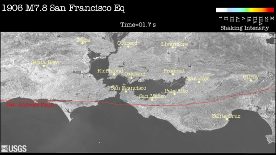
About the Epicenter: Earthquake starts at 0 seconds as a tiny patch of the fault begins to slip. We call the location where the rupture begins the "epicenter" when viewed on a map. The fault actually begins to slip deep below the earth (about 10 km or 6 miles deep for the 1906 earthquake), and seismologists call this point below the surface the "hypocenter" (sometimes referred to as the "focus" in textbooks).
About Seismic Waves: Both P and S waves are generated immediately and start radiating outward from the earthquake starting point like ripples moving out from a stone dropped into a pond. Earthquakes typically release less energy in P-waves than in S-waves, so the P-waves cause less intense shaking than S-waves. In this movie, the initial P-waves show up as light blue colors and S-waves cause the more intense yellow-orange colors to appear. Because P-waves travel fastest, they are the first to reach the beach in San Francisco. The S-waves are not far behind but don't appear on the map at 1.7 seconds because they are still traveling from the hypocenter at 10 km depth towards the surface, while the speedy P-waves have already emerged.
2.6 seconds
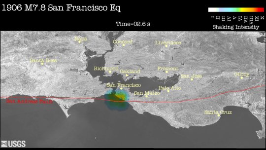
About Seismic Waves: S-waves are now visible, but they lag behind the P-waves because they travel slower. The blue and yellow-orange circles in the annotated image outline the very first P- and S-waves emitted from the hypocenter.
About Fault Rupture: Earthquakes are often shown as a single dot at their epicenter, but in fact there is movement along an entire, long section of the fault. For the 1906 earthquake, the San Andreas slipped over a 480-km-long section (300 miles) from Mendocino down to San Juan Bautista! Not all of the fault moves at once, however. Instead, the fault starts to "unzip," with the rupture growing and spreading out away from the hypocenter. The thick red line in the center of the annotated image shows the portion of the fault that has slipped thus far. In the movie, watch as the 1906 earthquake spreads out in both directions away from the epicenter. Some earthquakes only grow in one direction because a portion of the fault might be stronger and stay locked together, preventing the rupture from extending in both directions.
3.4 seconds
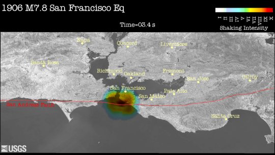
About Shaking Intensity: Shaking intensity is strongest close to the fault and dies off with distance away from the fault. Because only a small section of fault has slipped in the first 3.4 seconds, the pattern looks a lot like a bullseye centered around the short section of fault that has slipped so far (indicated by the thick red line in the annotations). As the fault rupture grows over time, the bullseye will start to elongate parallel to the fault to a more football shaped pattern. For example, watch the shaking intensity near San Mateo over time. Even though it is far from the epicenter, it is still close a portion of the fault that eventually ruptures. The same is true for all of Marin county, to the left (northwest) of the epicenter.
6.2 seconds
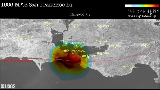
About Seismic Waves: Seismic waves are generated at every point along the fault as that portion of the fault ruptures. The thin lines in the annotations show the P- and S-waves generated early in the earthquake (e.g., at the epicenter). They continue to spread out like ripples on a pond. If the earthquake only emitted P-waves and S-waves at the beginning of the earthquake, the ripples would be perfect circles about the epicenter. However, additional shaking energy is added at the tips of the rupture, indicated by the thicker circles. The final, football-shaped pattern you see is the combination of a whole bunch of ripples generated in succession along the fault (like throwing a bunch of stones into the pond one after the other in a line along the fault). This is why shaking is intense all along the fault and not just near the epicenter.
Surface waves travel slower than P- or S-waves. They are difficult to see directly in this movie because they are mixed together with some of the S-waves.
16 seconds
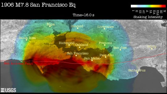
About Seismic Waves: Like a track and field race where one runner is faster than the other, the P-waves keep getting further and further ahead of the S-waves so that the distance between them gets greater as time goes on. Also, the shape of the wave fronts (thin lines in annotations) is not perfectly smooth. This is because seismic waves travel at different speeds through different types of rock. P-waves are always faster than S-waves, but all the waves get slowed down in some materials. Think of this as the difference between running on a smooth track (hard rock, like granite) versus thick mud (loose, poorly compacted sediments and soils).
About Shaking Intensity: Near Tomales Bay, the dark colors indicate extremely strong shaking. In this case, the intensity is due to the fact that in the 1906 earthquake more energy was released in that section of the fault than along any other stretch. Different portions of the fault can move different amounts in the same earthquake. Here, the two sides of the fault slid more than 30 feet, while the slip at the epicenter was only about 12 feet (See a map of how much the fault slipped). The epicenter only indicates where shaking starts -- not where shaking is most severe. The huge amount of movement near Tomales Bay released a huge amount of seismic energy, resulting in violent shaking.
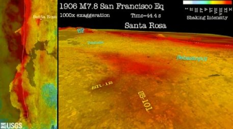
30 seconds
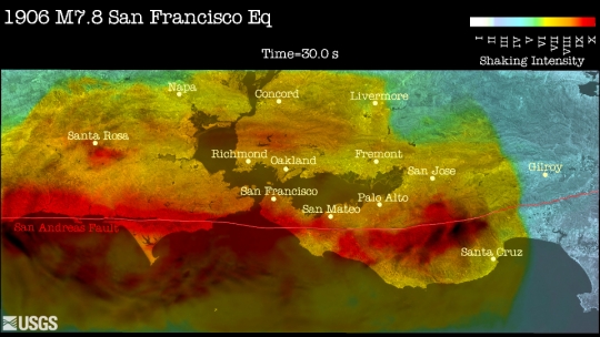
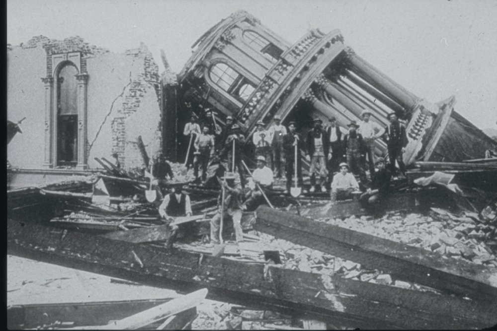
About Shaking Intensity: Seismic waves dissipate as they travel through the earth, so shaking is usually most severe closest to the fault. However, some types of rock and soil amplify shaking for the communities built on top of them. An excellent example is the city of Santa Rosa, which experienced very serious damage in 1906 (Download a classic photo of the destroyed city hall. When these soft soils extend deep down and are surrounded by harder rocks (a "sedimentary basin"), the waves get trapped and slosh around like waves in a bathtub, making shaking last longer and damage more severe. The dark red colors reflect the strong shaking in the soft Santa Rosa basin. A similar effect is visible in a valley above Richmond in the image.
This computer simulation does not include the shallowest layer of soils such as Bay muds that surround the margin of the San Francisco Bay (because our computers are not yet big and fast enough to handle these small features). The actual observed shaking was much more severe around the Bay than these simulations show. Take a closer look at the actual shaking intensity on the Bay margins during 1906.
See a 3-D perspective movie with a closeup of Santa Rosa, below.
After 30 seconds
About Fault Rupture: The rupture for the 1906 earthquake continues to expand along the fault for 54 seconds to the south and 90 seconds to the north. It stops when it hits a section of the fault that is strong enough to stop the rupture. That section will eventually need to slip in future earthquakes. Smaller magnitude earthquakes sooner, before the rupture has propagated very far. Scientists are still trying to learn more about what causes ruptures to stop, so they don't fully understand why some earthquakes are big and some are small.
About Shaking Intensity: Shaking at any given location can continue for a long time for two reasons:
- Waves continue to arrive from distant parts of the fault. Because these waves travel so far, these are less intense by the time they arrive.
- Seismic waves trapped in sedimentary basins continue to slosh around like waves in a bathtub.
Both of these effects diminish with time, but they can still cause damage to structures that were weakened by earlier intense shaking.
Watch a fault "unzip"
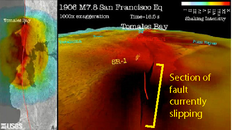
normal resolution
See the comments for the image of the shaking map from 2.6 seconds that discusses the length of a fault rupture. This video clip shows the earthquake rupture running through Tomales Bay. The dark black blob along the fault shows the part of the fault that is actually slipping at each point in time. The deformation is exaggerated by a factor of 1000 causing the appearance that the fault opens and closes during the shaking. Notice the small peninsula in the middle of the image moves toward you as a result of slip on the fault. This peninsula moved 15 feet in the earthquake, so without the exaggerated deformation it remains attached to the mainland.
Watch a sedimentary basin "ring"
normal resolution
HD resolution
See the comments for the image of the shaking map from 30 seconds that discusses basin effects. Santa Rosa is an excellent example where you can watch the region slosh around long after the main shaking passes.
Which way do the waves appear to come from? They start coming directly from the epicenter (top center of image), but by 20-25 seconds, they are coming from the right part of the frame and by 43 seconds they seem to come in from far to the right (far north). This change reflects the continuing growth of the rupture. The later waves come from the newest part of the rupture further to the north as the fault progressively "unzips" northward. This pattern of incoming waves is complicated by the sloshing around of waves within the sedimentary basin.
Compare the Santa Rosa basin, below, to Tomales Bay. How long does the shaking last at each location? Watch the motion of the land and not the colors. Both experience extremely strong shaking (dark red colors), but the duration of shaking differs at the two sites. While Tomales Bay does continue to move a little after the rupture passes, it does not slosh and jiggle like the Santa Rosa basin because the underlying rock is more rigid in Tomales Bay.
Illustration of Wave Motions
normal resolution
By focusing on a specific spot in the closeup movies, you can observe the wide range of shaking motions characteristic of the different wave categories, such as S- and surface waves. Even though the motion is exaggerated by a factor of 1000, the P-wave motions are still too small to see in these movies.
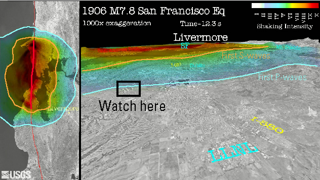
Using the movie below, we have highlighted a specific location where different wave motions are most apparent. While we provide specific details for features to look for below, it may be difficult for students to see them. The main goal is to recognize that there are a variety of directions of motions, and this variety is due in part to the different types of waves. A secondary goal is to recognize how waves arrive from different directions over time associated with rupture from different parts of the fault.
Surface waves are easiest to recognize in the movie. There are two primary categories of surface waves, Rayleigh waves and Love waves (simple animation with background information). Seismologists break surface waves into these categories because they move at different speeds through the earth and the direction of motion is different between them. The video clip of Livermore basin illustrates some of these differences. Show the following video clip several times, asking students to observe the small hills shown in the black box below labeled "Watch here." Try to observe which direction that spot moves at different points in the movie (e.g., up and down, side-to-side, back-and-forth, etc...). The differences are subtle and go by quickly, but it's an interesting illustration for older students with keen observation skills. It may be best to advance through the movie frame by frame so that the movie goes more slowly. Compare the motions to the cartoon animations.
| Wave category | First arrival time | Recognized by | Calculated velocity* | Typical Velocity |
|---|---|---|---|---|
| P-wave | 12.3 seconds | Light blue color (lower amplitude shaking) Forward-and-back motion, though too small to observe in movie |
5400 m/s (13300 mph)* | 5000 - 7000 m/s |
| S-wave | 24.7 seconds | Orange color (higher amplitude shaking) up-down or Side-to-side motion, though hard to recognize in this movie |
2700 m/s (6600 mph)* | 3000 - 4000 m/s |
| Surface waves | ||||
| Rayleigh wave | around 32 seconds | Up and down and forward-and-back motion, similar to an ocean wave | 2100 m/s (5100 mph)* | 2000 - 4400 m/s |
| Love wave | around 36 seconds | Side-to-side motion | 1900 m/s (4500 mph)* | 2000 - 4200 m/s |
*The times listed above are for the very first time that you can notice the waves arriving of the given category. However, waves and energy continue to arrive for a long time from more distant sections of the rupture. We list very precise times for the P- and S-wave arrivals but less precise times for the surface waves. This is because the surface waves are mixed in with later-arriving S-waves and share many features in common with them. It can sometimes be difficult to distinguish between the these categories of waves. The wave velocities calculated in the table are slower than the velocity you would measure if you could recognize the more subtle earlier arrivals of the same categories of waves. This exercise could be done more precisely using individual seismograms recorded by sensitive instruments (rather than by eye from a video).
Activity: Calculating Wave Velocities
The box labeled "Watch here" is about 66.9 kilometers (45.6 miles) from the earthquake epicenter. Calculate the speed of each type of wave by the following process (answers in table above):
- Record the precise time when each wave arrives. This is easiest for P- and S-waves, which are recognized by the change in colors.
- Convert the distances and times to the desired units. Your measured time is in seconds. If using meters per second, convert the distance into meters. If using miles per hour, convert the time into hours (should be a small fraction of an hour).
- Distance = Velocity * Time. So, calculate the velocity by dividing the distance by the time.
- Consider the meaning of these numbers. A person walks about 1 m/s and a bullet travels about 1000 m/s (~2200 mph). These waves are literally "faster than a speeding bullet!."
- How much warning time would you have of approaching strong S-wave shaking if you lived 10 km from the epicenter of a large earthquake? 50 km? 100 km? [Read more about earthquake early warning]
To calculate these velocities, you have to assume that the waves you see were generated at time 'zero', which means that they are coming directly from the earthquake epicenter and not from other parts of the earthquake rupture. Is this a good assumption? (Not really -- waves are generated along the entire length of the rupture, so their "starting time" will vary. Seismologists use computer simulations, such as the ones shown here, to understand the details of this complex shaking.)